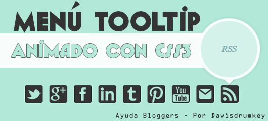
Agregar menú al blog.
Lo primero que debemos hacer es agregar el HTML al blog. Entrando en su plantilla buscan <body> agregando dentro de <body> en la sección que ustedes deseen donde se verá tu menú social. También deben reemplazar el # que se encuentra en href="#" por los enlaces de sus cuentas sociales, fíjense en el nombre de los class="nombredelclass" y van cambiando de acuerdo a eso el # por sus links.Agregando estilos (CSS3):
Es el turno de los estilos, entonces buscarán en su plantilla ]]></b:skin> e insertarán el código CSS antes justo arriba:}
.nav-tt{
padding: 50;
width: 70%;
height: 70px;
margin: 80px auto 30px auto;
}
.nav-tt li{
float: left;
list-style: none;
}
.nav-tt li a{
display: block;
width: 40px;
height: 40px;
margin: 0 2px;
outline: none;
position: relative;
z-index: 2;
text-indent: -9000px;
text-decoration: none;
}
.nav-tt li .gplus{
background: url(https://blogger.googleusercontent.com/img/b/R29vZ2xl/AVvXsEj-_Fn7BVTN-0IKHaQHbN3n2P9EdOFZ7T_U9gAmNWn6Cr4tHyhlURZeAYUhVSBdjKkl8mRDJCo3BVblQusnm9E4Iy3iRBFhFoe_WrwWyVZw3rHlSYvnuA_66UyAl0AhqX3dgELlaeyzH3D4/s128/google_plus.png) no-repeat;
}
.nav-tt li .twitter{
background: url(https://blogger.googleusercontent.com/img/b/R29vZ2xl/AVvXsEjTDy818iY0EBR81U5uFSQsPMHakm03ffjlBXV1AGpJP5nLo8AiSS7-eZJNFSpSIDpEV2SIS8ai5luAjbTpAs0E49PX33VGK3PtxubxhBRMwLR3i1djKUmn58AdU4iCvqFDR3ZM4ytSA7Yk/s128/twitter_1.png) no-repeat;
}
.nav-tt li .pinterest{
background: url(https://blogger.googleusercontent.com/img/b/R29vZ2xl/AVvXsEhjdnFeBIFQLYG2YbdOgoGlxPPA26l75aB4f6C0GuFKA6HQeSOaH0pqXTNYXM0rB59IlKUD4kpN_u4ksc_xVz2R8Z-Oc0qwSbepG3SADivfe1W72u7nWBOI5xdHs8QY02TrPSPhpLR7PIKT/s128/pinterest.png) no-repeat;
}
.nav-tt li .facebook{
background: url(https://blogger.googleusercontent.com/img/b/R29vZ2xl/AVvXsEh334YVA9R_rkcCxu4Iqhz8B0w8nfSWfJdJ0gBnTBGPAheHJ-ccDiJ-KepuOd9iTDQvrH_8clSBkjbFMeh24Y9H3gaeg-OflNhnOMhCiRhhD3kkFzJ-wt8jDJGM_34uVKceMyGkkWvR2DPD/s128/fb_1.png) no-repeat;
}
.nav-tt li .linkedin{
background: url(https://blogger.googleusercontent.com/img/b/R29vZ2xl/AVvXsEjkLSGcVziSAFGQnNaW3vPU_xh_Szro-GGDcmSflpd3Nu57pB4SWz6KFJpIymgvxZfzDyq6_DUevkI703czueB0v_4_4D4r0oS5CnInhzV1J6r8dnhrjPgLULF048Ld5aWosllrqpPiOfAu/s128/linkedin.png)no-repeat;
}
.nav-tt li .tumblr{
background: url(https://blogger.googleusercontent.com/img/b/R29vZ2xl/AVvXsEi7cMmHg0bMCQz_TMgdZuB5N6HyYC_cmQ97J9EPoGKXq7KK9VLPktXhgXpbyUKnGi0rOp9mloDwp-NkVSaSV3xHnFNI1RgUUXTvB7IJGV20MlvQGCxWNBMwkpa_syn6XXWPxi3NwvnGEDEj/s128/tumblr.png) no-repeat;
}
.nav-tt li .youtube{
background: url(https://blogger.googleusercontent.com/img/b/R29vZ2xl/AVvXsEi5dtaU99cLfrlcTyhwbHe1bqFtHuqc4k4AWsG_soy-zcPxQ4hYJEfTmpNIqAVH3NViVcrj0o4BC3IARE5ysa1L3KbL782x6FgJjKECttQYpfGJK7e7b0Y-Lw13z40E-w9YLaiFS7OYNCap/s128/you_tube.png) no-repeat;
}
.nav-tt li .mail{
background: url(https://blogger.googleusercontent.com/img/b/R29vZ2xl/AVvXsEim_TNhYK8MENFlPo4qoIP1lJ2gOiVWuTwM8CD_5rcfIqtpDN0oBXdPowpmxtt_d4hXfWlk85MqWt36mu8jtLRJcm26QMdSfmF5dVeD7N2lOnnmlF-IBChuKK_oJeVnp_905ZNsnqJ9KP4f/s32/email.png) no-repeat;
}
.nav-tt li .rss{
background: url(https://blogger.googleusercontent.com/img/b/R29vZ2xl/AVvXsEi8FfU5S7Orhsfdmgc_VofjARoatWw2GsEz6sFx4ZDmh1Bb66jiTP3RSi5-PMhhj7gLq-kHaJ5mkOXFpvjyJztz7043P8BDvbNvaMrzX9Ed4y9kS6GHiP63UG5rJaYLHsJ4GiBPJi7toFtY/s128/rss.png) no-repeat;
}
.nav-tt li a span{
width: 80px;
height: 80px;
line-height: 80px;
padding: 10px;
left: 50%;
margin-left: -60px;
font-family: 'Alegreya SC', Georgia, serif;
font-weight: 400;
font-style: italic;
font-size: 14px;
color: #719DAB;
text-shadow: 1px 1px 1px rgba(0, 0, 0, 0.1);
text-align: center;
border: 5px solid #ffffff;
background: rgba(255,255,255,0.5);
text-indent: 0px;
position: absolute;
pointer-events: none;
border-radius: 50%;
bottom: -40px;
opacity: 0;
box-shadow: 0px 0px 10px 0px rgba(0,0,0,0.1);
-webkit-transform: scale(0);
-moz-transform: scale(0);
-o-transform: scale(0);
-ms-transform: scale(0);
transform: scale(0);
-webkit-transition: all 0.3s ease-in-out;
-moz-transition: all 0.3s ease-in-out;
-o-transition: all 0.3s ease-in-out;
-ms-transition: all 0.3s ease-in-out;
transition: all 0.3s ease-in-out;
}
.nav-tt li a span:before,
.nav-tt li a span:after{
content: '';
position: absolute;
bottom: -15px;
left: 50%;
margin-left: -9px;
width: 0;
height: 0;
border-left: 10px solid transparent;
border-right: 10px solid transparent;
border-top: 11px solid rgba(0,0,0,0.1);
}
.nav-tt li a span:after{
bottom: -13px;
margin-left: -10px;
border-top: 10px solid #ffffff;
}
.nav-tt li a:hover span{
opacity: 0.9;
bottom: 50px;
-webkit-transform: scale(1);
-moz-transform: scale(1);
-o-transform: scale(1);
-ms-transform: scale(1);
transform: scale(1);
}
¡Opciones!
Simplemente con lo anterior ya obtendremos la funcionalidad de nuestro menú social, pero les comentaré algunas opciones por si lo quieren personalizar mas a su gusto.Agregar o quitar icono y enlace.
Para poder agregar o quitar marcadores, solo debemos ir al HTML buscar class="nav-tt" en donde encontraremos lo mismo de arriba (El primer codigo). Para agregar un nuevo enlace, solo deben agregar antes de </ul> y editando según tus datos descritos en los comentarios dentro del código:Después debemos ir al CSS de nuestra plantilla buscando ".nav-tt li a span" (Sin comillas) y antes de ella agregar:
.nav-tt li .Nombre-class-anterior{
/*Agregar nombre del class anterior nombrado en el HTML*/
    background: url(Pegar aquí enlace de tu icono) no-repeat;/*Enlace de icono*/
}
Para quitar solo deben hacer lo contrario (Suprimir el CSS del enlace y su HTML). Efectos:
Para cambiar el tiempo de cómo se muestra el tooltip solo deben buscar ".nav-tt li a span" (Sin comillas) y editar esto:-webkit-transition: all 0.3s ease-in-out; /*-------------------------------*/Ejemplo con tiempo de 1 segundo: Para cambiar la escala o tamaño deben editar esto:
-moz-transition: all 0.3s ease-in-out;/*Cambiar 0.3 por el tiempo que*/
-o-transition: all 0.3s ease-in-out;/* Quieras, se representa en */
-ms-transition: all 0.3s ease-in-out;/* Segundos (0.3 segundos) */
transition: all 0.3s ease-in-out;/*------------------------------------*/
-webkit-transform: scale(0);/*-------------------------------*/Ejemplo escala de 10 con tiempo de 0.5 segundos: Nota: Recuerden que pueden ahorrarse el tiempo de usar prefijos en el CSS usando PREFIX FREE. Bueno queridos lectores espero que les guste mi trabajo y les sea de utilidad en sus proyectos y compartanlo. Saludos malignos :)
-moz-transform: scale(0);/*Cambiar (0)*/
-o-transform: scale(0);/* Por el tamaño */
-ms-transform: scale(0);/* que quieras */
transform: scale(0);/*------------------------------------*/
No hay comentarios:
Publicar un comentario